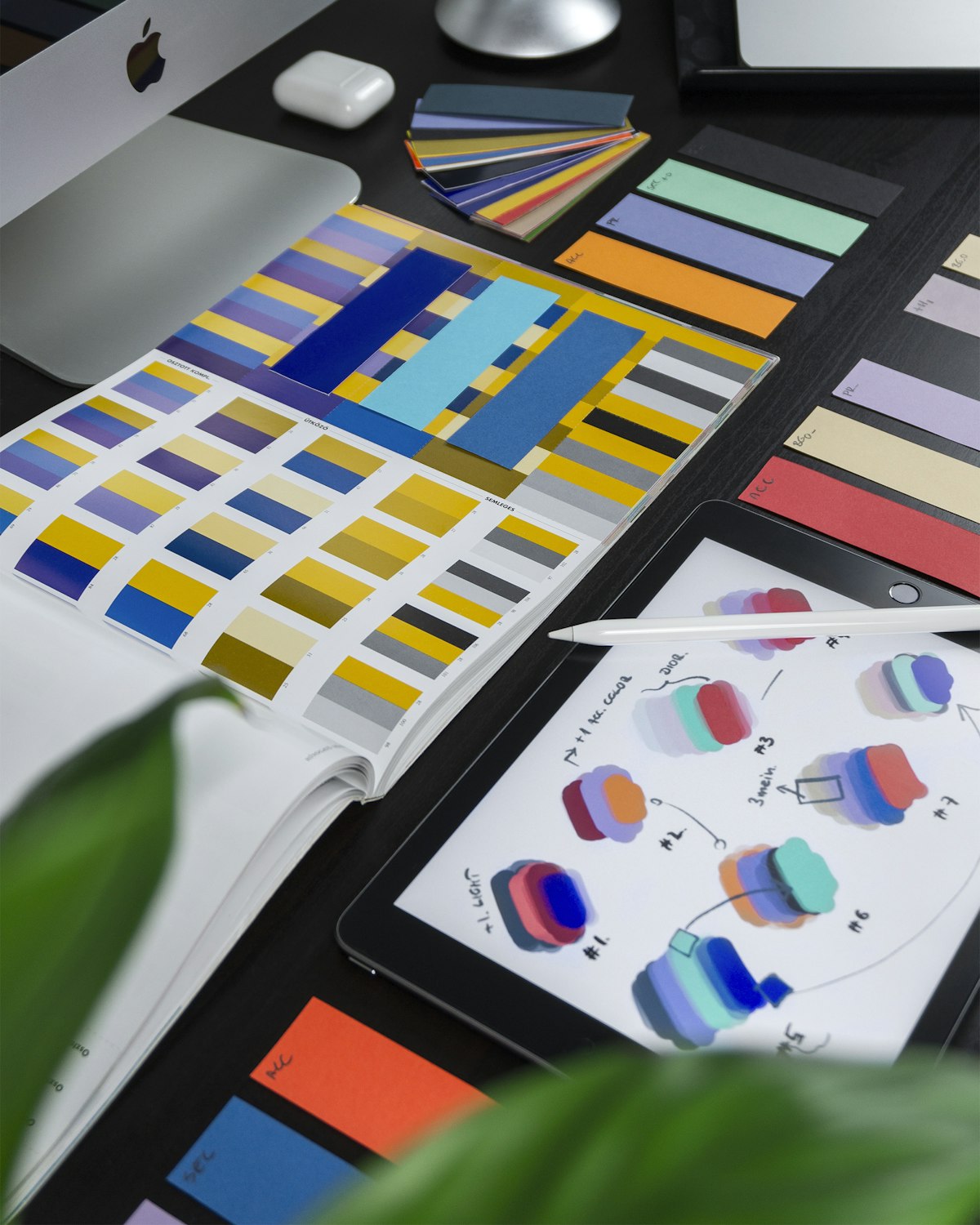
UI/UX Pro Max: The Design Intelligence Skill for AI Coding Agents
The Problem with AI-Generated UI
There's a persistent gap in AI-assisted development: the code works, but the UI doesn't look right.
Not broken — just generic. The color palette is flat. The typography lacks hierarchy. The spacing feels arbitrary. The component styles don't match the product type. The AI knew how to write the React, but it didn't know what the React should look like.
This is the gap that UI/UX Pro Max is built to close.
---
What UI/UX Pro Max Actually Contains
This isn't a style guide. It's a searchable design database — structured so an AI agent can query it and get precise, reasoned recommendations.
The numbers are specific: 161 color palettes, 57 font pairings, 50+ visual styles, 161 product types, 99 UX guidelines, and 25 chart types. All of it organized across 10 technology stacks: React, Next.js, Vue, Svelte, SwiftUI, React Native, Flutter, Tailwind, shadcn/ui, and plain HTML/CSS.
The design system generation command illustrates how it works in practice:
python3 skills/ui-ux-pro-max/scripts/search.py "fintech dashboard modern" --design-system -p "MyApp"This runs parallel searches across product type, style, color, typography, and landing pattern domains — applies reasoning rules from a curated CSV — and returns a complete design system: the right pattern, style, color palette, font pairing, and effects for that specific product type. Not a generic recommendation. A reasoned one.
---
Ten Stacks, One Skill
Most design-focused skills are web-only. UI/UX Pro Max covers the full spectrum of modern development platforms:
Web: React, Next.js, Vue, Svelte, Tailwind CSS, shadcn/ui, HTML/CSS Mobile: SwiftUI (iOS), React Native, Flutter
Each stack gets implementation-specific guidance, not just visual principles. The React Native stack, for example, covers touch target sizes (44pt iOS / 48dp Android), safe area compliance, gesture conflicts, system gesture support, and platform-specific navigation patterns — things that matter for shipping, not just prototyping.
---
The Design System Hierarchy
One of the more sophisticated features is the persisted design system with hierarchical override:
# Save master design system
python3 skills/ui-ux-pro-max/scripts/search.py "saas productivity tool" --design-system --persist -p "MyApp"

# Add page-specific overrides
python3 skills/ui-ux-pro-max/scripts/search.py "data visualization" --design-system --persist -p "MyApp" --page "dashboard"
This creates:
design-system/MASTER.md— global design rules for the entire productdesign-system/pages/dashboard.md— dashboard-specific deviations
When building any page, the agent checks for a page-specific override first, then falls back to the master. It's the same pattern design systems teams use manually — now automated and queryable.
---
What's Inside the UX Guidelines
The UX checklist isn't abstract principles — it's specific, verifiable rules mapped to real standards.
Priority 1 (Critical): Contrast ratio 4.5:1, visible focus rings, alt text, aria-labels, keyboard navigation, skip links, sequential heading hierarchy.
Priority 2 (Critical): Touch targets ≥44×44pt, 8px gap between targets, loading feedback, no hover-only interactions.
Priority 3 (High): WebP/AVIF images, lazy loading, CLS < 0.1, font-display: swap, code splitting, debounce/throttle for high-frequency events.
Each rule is sourced: Apple HIG, Material Design, WCAG — so when the agent applies a rule, it's applying a documented standard, not a preference.
---
Styles You Can Actually Use
The style coverage goes beyond the handful of styles most guides include:
Glassmorphism, claymorphism, minimalism, brutalism, neumorphism, bento grid, dark mode, responsive, skeuomorphism, flat design — plus 40+ more. Each style comes with matching color palette recommendations, anti-patterns to avoid, and component-level guidance for staying consistent.
The color palette system maps palette choices to product type: fintech gets different defaults than healthcare, entertainment, or SaaS. The font pairing system matches heading/body combinations to industry and style.
---
Pre-Delivery Checklists
The skill includes explicit pre-delivery verification checklists for visual quality, interaction, light/dark mode, layout, and accessibility.
Visual quality: no emojis as icons, consistent icon family, official brand assets, no layout-shifting press states, semantic theme tokens.
Interaction: tap feedback within 80–150ms, touch targets ≥44pt, micro-interaction timing 150–300ms, disabled states semantically clear, gesture conflicts prevented.
Light/Dark Mode: primary text contrast ≥4.5:1 in both themes, dividers distinguishable, modal scrim 40–60% opacity, both themes tested independently.
These aren't suggestions — they're checkboxes. The skill is designed to be run as a final quality gate before shipping UI code.
---
How to Install
npx skills add nextlevelbuilder/ui-ux-pro-max-skillAfter install, the agent will automatically invoke the skill when the task involves UI structure, visual design decisions, interaction patterns, or UX quality control. The trigger condition is explicit: if the task will change how a feature looks, feels, moves, or is interacted with, this skill should be used.
---
Who This Is For
UI/UX Pro Max targets developers who use AI coding agents to build real products — and who've noticed the gap between functional code and polished UI.
It's especially useful when you're working across multiple stacks (web + mobile), when you need a consistent design system across a project, or when you want the AI's design choices to be defensible rather than arbitrary.
The underlying assumption: AI can write excellent React. What it needs help with is knowing which color system, which typography scale, which interaction pattern, and which accessibility rule to apply — for this specific product type, in this specific stack, at this specific priority.
That's what this skill provides.
Install: npx skills add nextlevelbuilder/ui-ux-pro-max-skill
→ View on GitHub · → Browse the full skill catalog
---
Spotted a skill worth adding to the catalog? Submit it here →
Explore More AI Skills
Discover and install the best AI agent skills to supercharge your workflow.
Browse All Skills →Weekly digest of the best new Claude skills and MCP servers. No spam.